The role
Promoted after two years at the company, I led a team of four designers while delivering user-focused, high-impact features. I streamlined workflows, improved stakeholder communication, and drove key projects including Ratings & Reviews, Debenhams onboarding, brand style guides, and a region-aware Size Guide built to reduce returns.
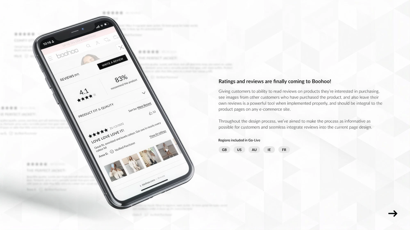
Ratings & Reviews was the largest of these. It touched the product page, the account area, transactional email and the moderation tooling behind them, which meant working across Product, Engineering, CRM, Customer Service and Legal rather than within a single squad.
The problem
Boohoo had no way for customers to leave product reviews. For clothing, that gap matters more than in most categories — fit and quality can’t be judged from a photograph, and a customer deciding between two similar items has nothing to go on but the imagery and a size chart.
Competitors had offered reviews for years. Customers were arriving with an expectation the site couldn’t meet, and Customer Service was fielding fit questions that other customers were already best placed to answer.
Give customers the fit and quality insight they need to buy with confidence.
Make leaving a review effortless enough that enough customers actually do it.
What customers actually needed
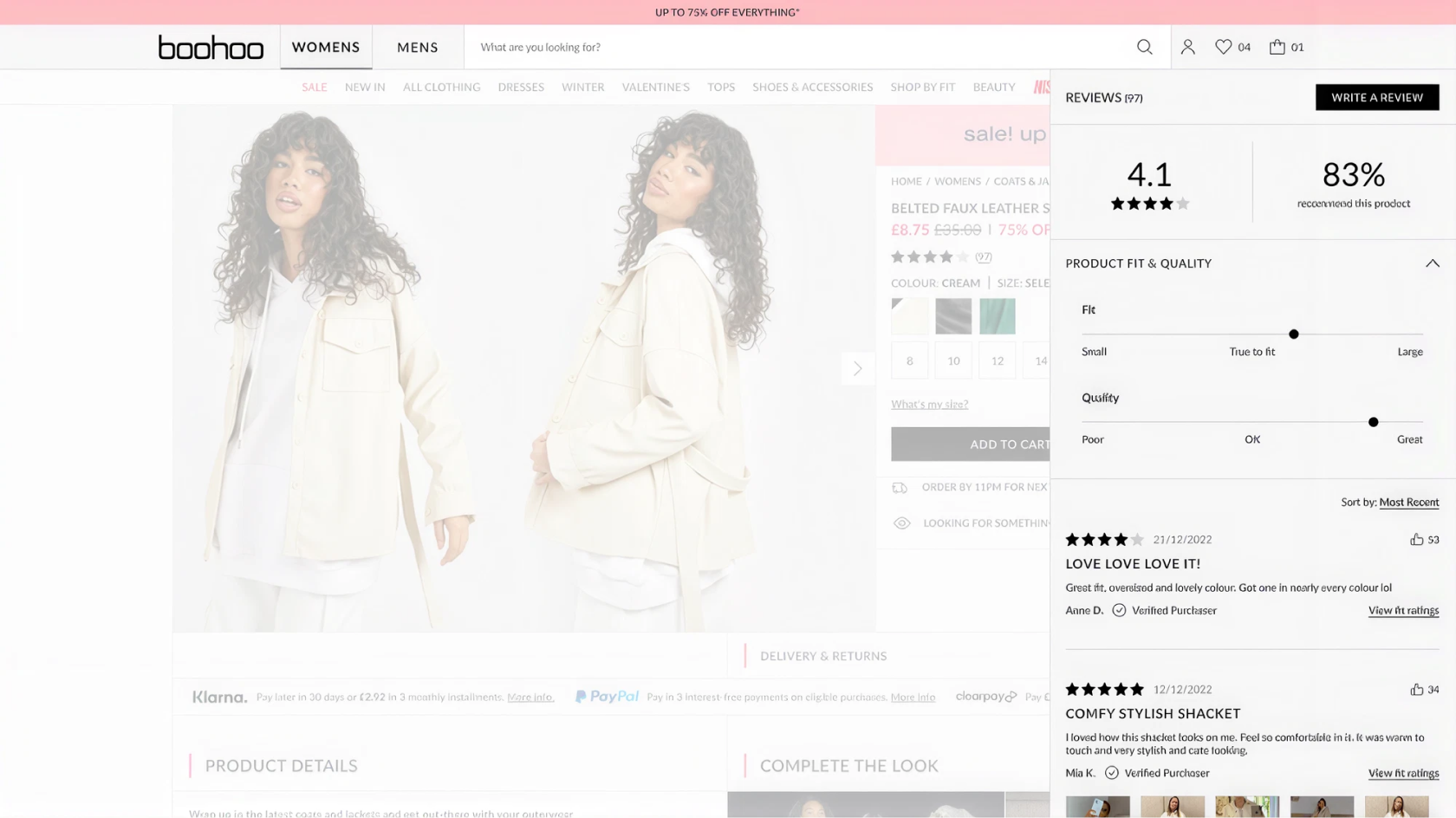
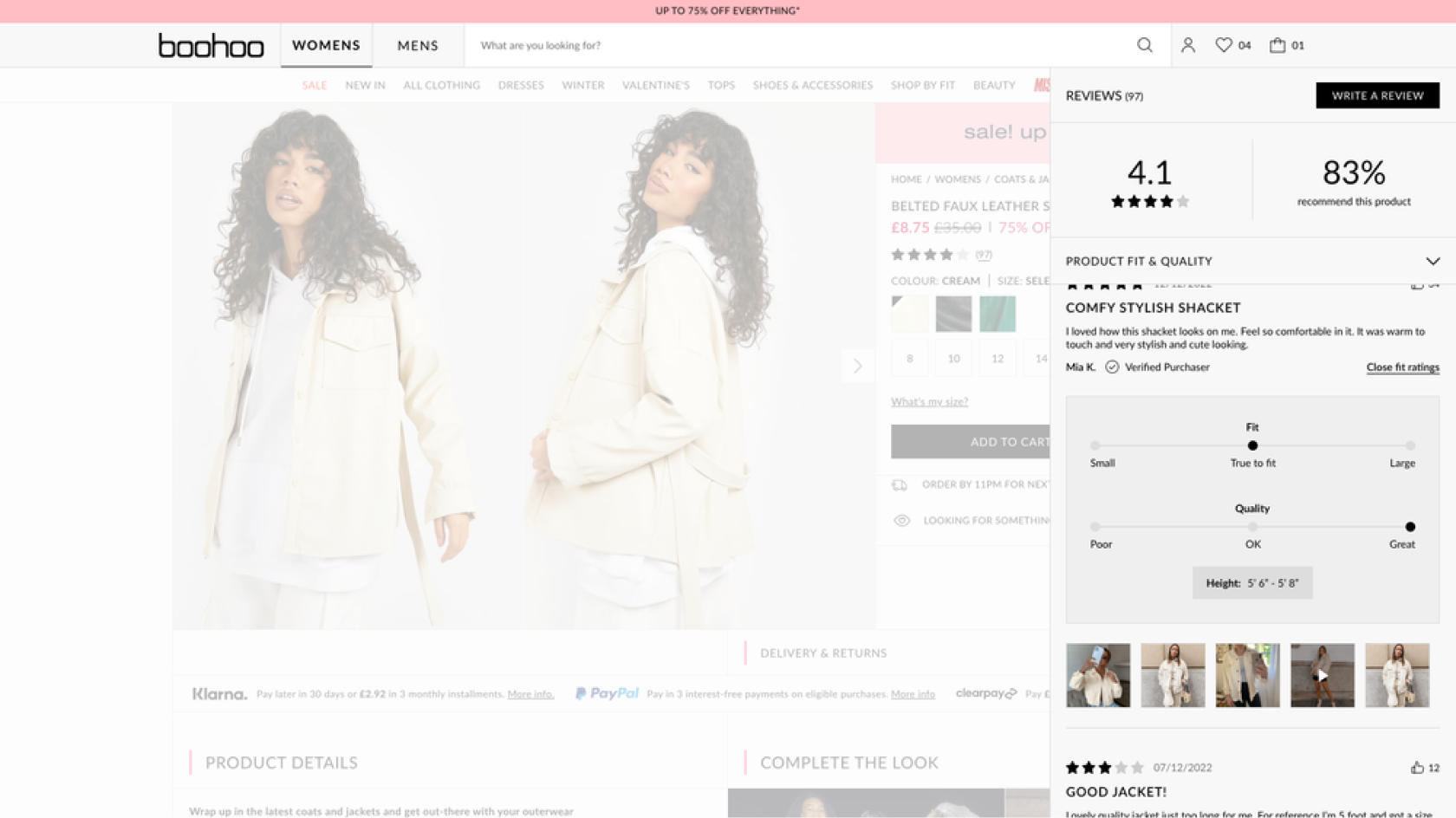
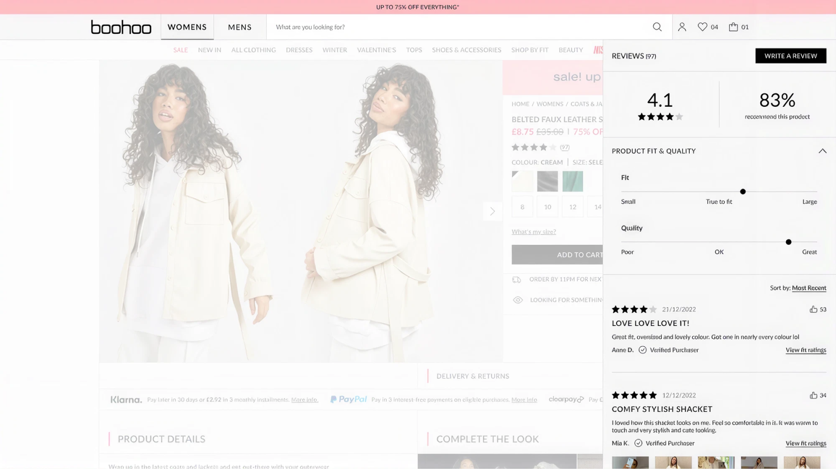
Before designing anything, we needed to know which part of a review a clothing customer actually reads. The answer shaped the entire display.
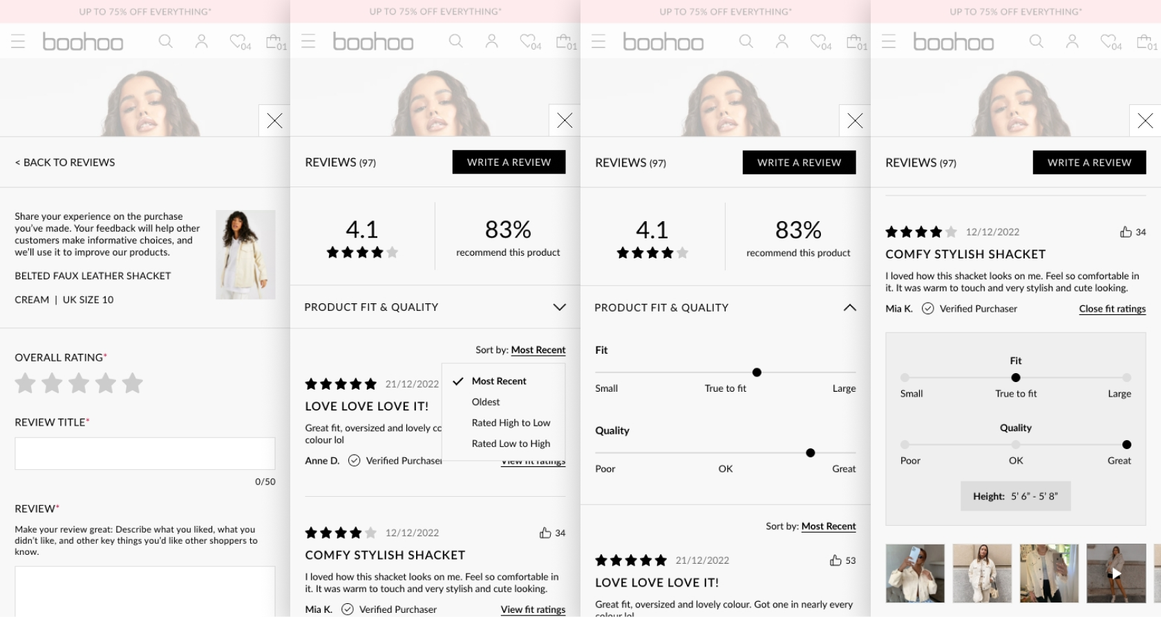
Designing the review display
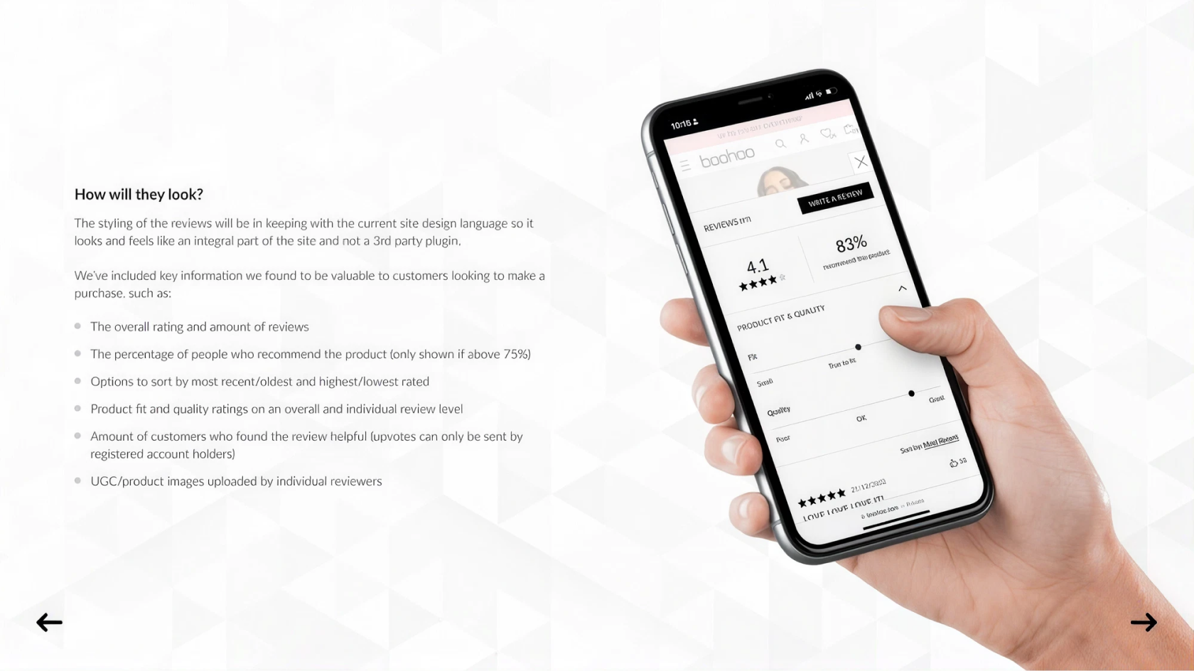
3 elementsThe styling had to sit in keeping with the existing site design language so it read as an integral part of the page rather than a third-party plugin bolted on. Everything shown earned its place by being useful to a customer mid-decision.
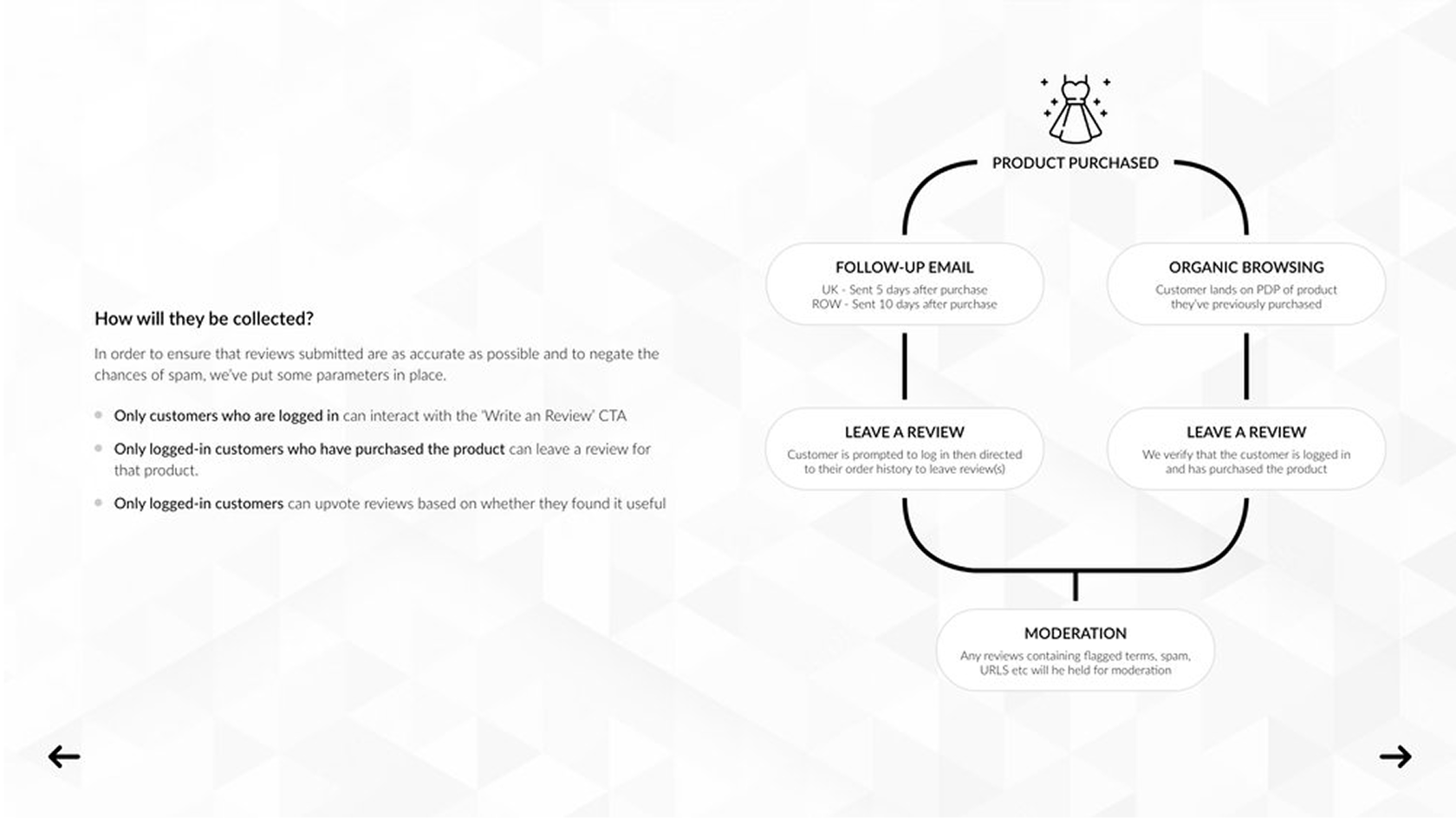
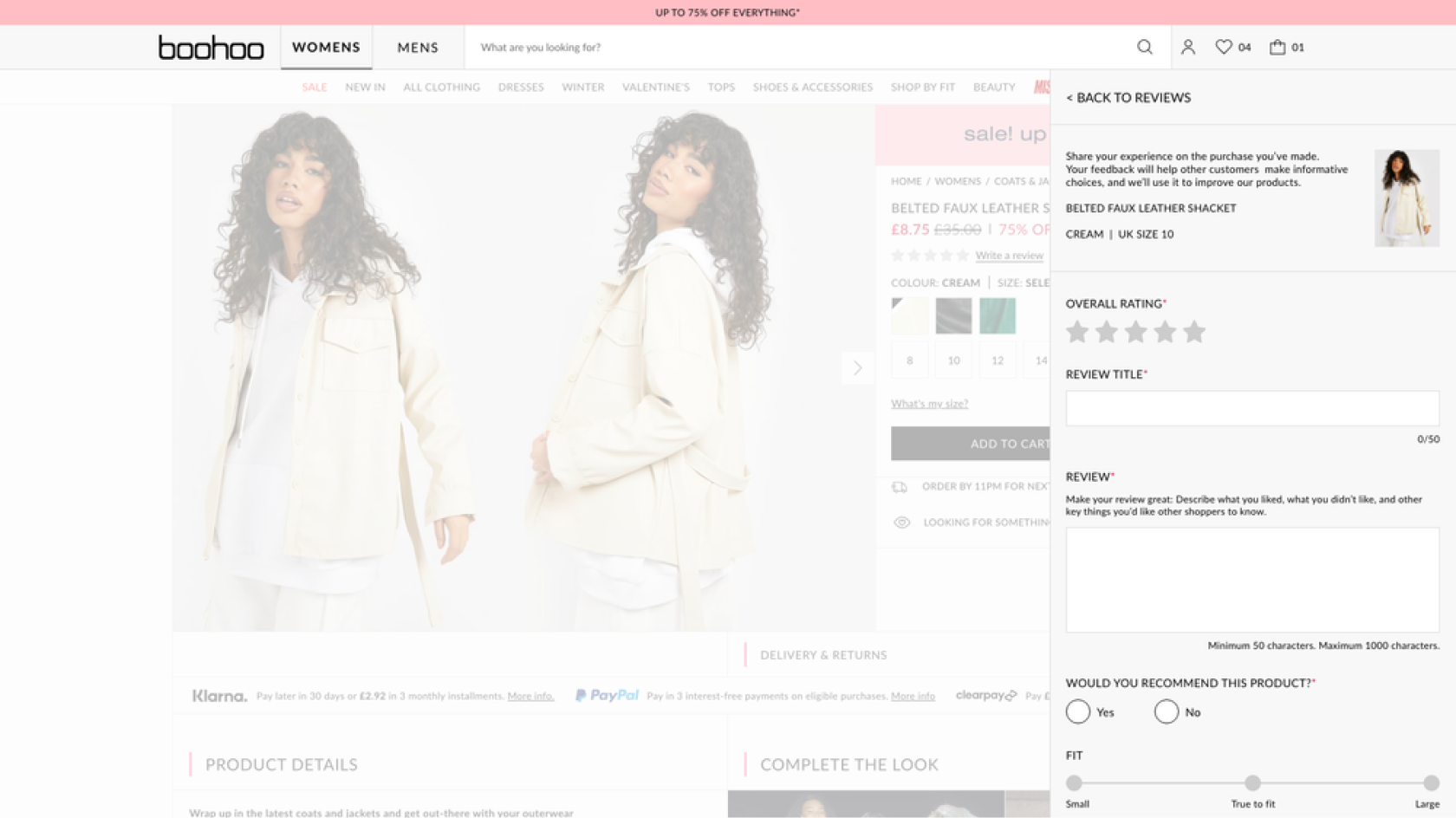
Writing a review
Reading reviews is worthless if nobody writes them. The submission flow had to work from three separate starting points without becoming three separate designs.
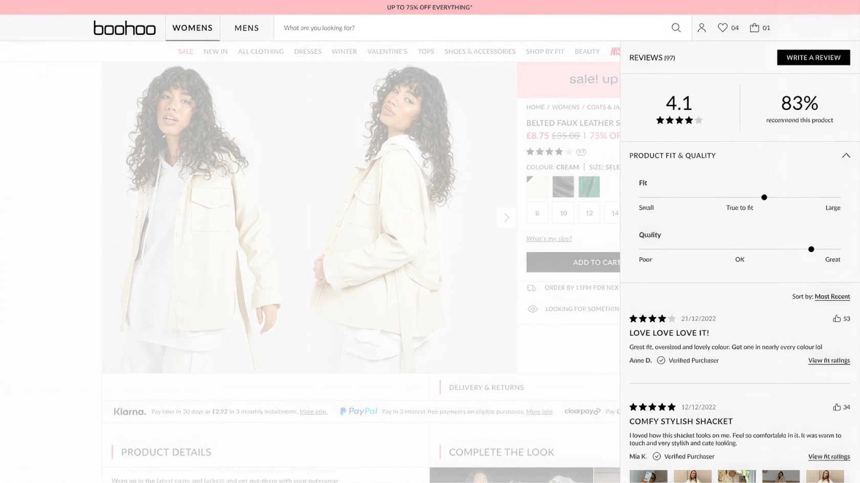
Where reviews appear
Reviews rolled out on web first, with the App to follow. They sit on product detail pages, with listing-page surfacing planned for a later phase so ratings can begin influencing customers earlier in the journey.
Rollout across regions
Launching in five regions at once meant the display had to survive translation and a moderation process had to exist before a single review went live.
Five regions at launch
GB, US, AU, IE and FR went live together, which meant the display had to accommodate translated copy without breaking the layout — French review text runs materially longer than English at the same word count.
Moderation
Every review passes through moderation before publication. I worked with Customer Service to design the queue interface and the rejection reasons, so the team could clear volume without slowing publication to a crawl.
The Size Guide
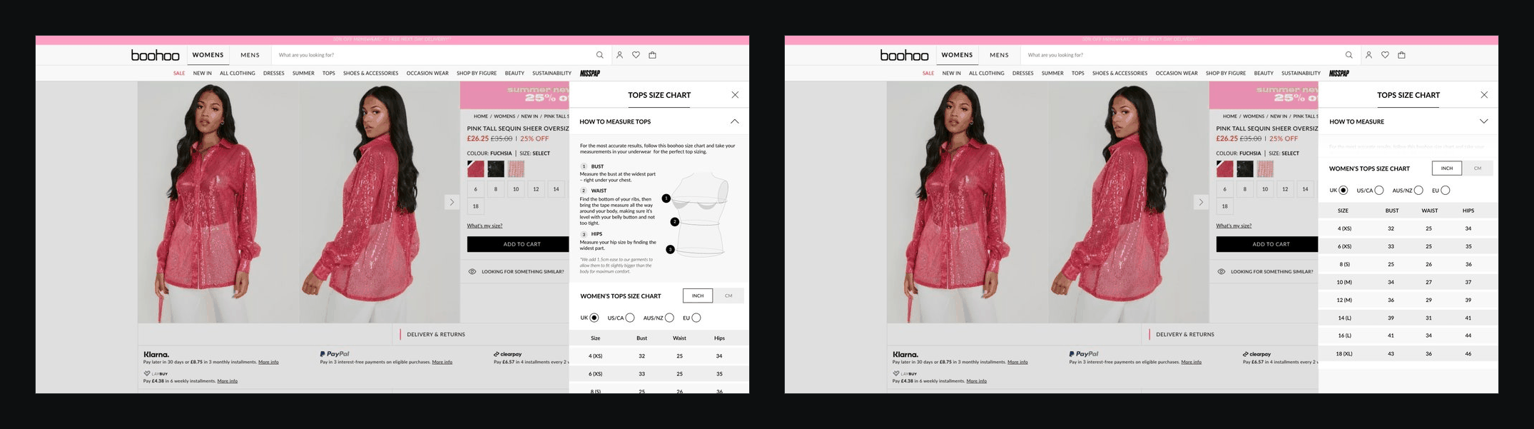
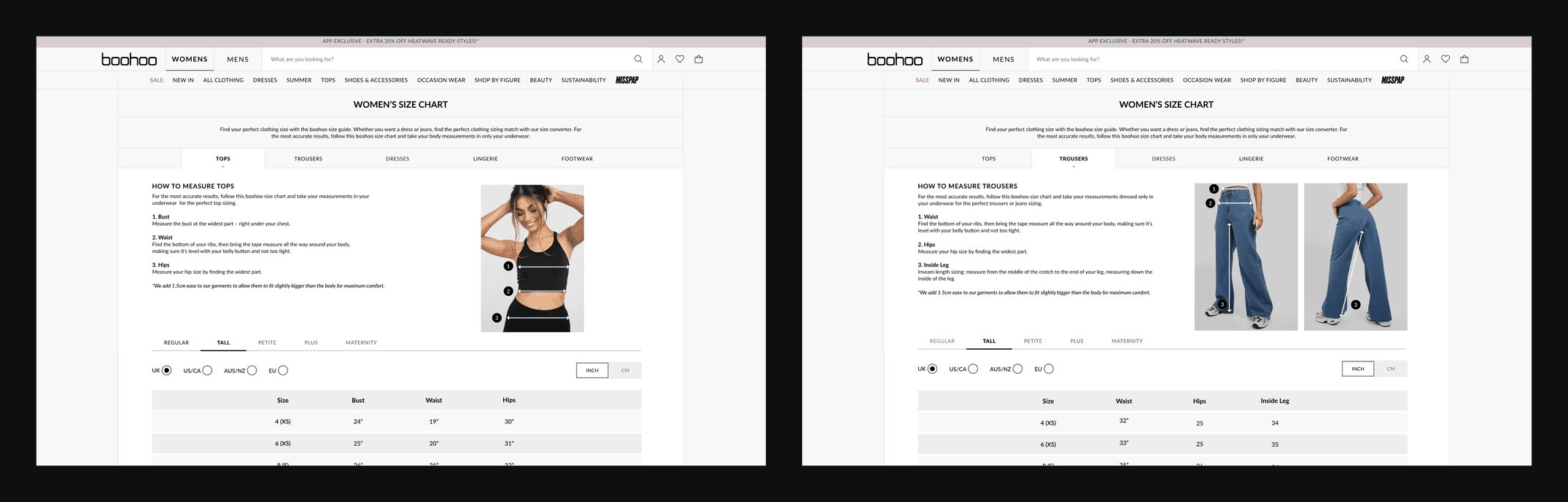
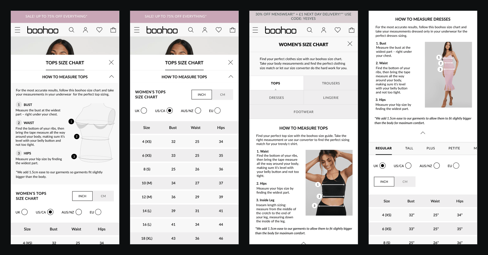
Reviews answered whether something fits from other customers’ experience. The Size Guide had to answer it before anyone had bought anything, and it wasn’t. One guide covered everything, so customers had to find their way through measurements that had nothing to do with what they were buying. The confusion showed up in returns, which were costly for the business to handle.
I restructured it into product-specific guides that show only the information that matters for that product, and added region detection so sizing is set to each customer’s location. Getting it live meant working with Legal, Garment Tech, SEO, Delivery Managers and Senior Leadership, so it met every requirement and fitted the wider business goals.
The outcomes
6 recordedMeasured across the first 90 days after go-live, against a pre-launch baseline taken from the same set of product pages.
Result
Customers could finally answer the only question that mattered — will this fit me.